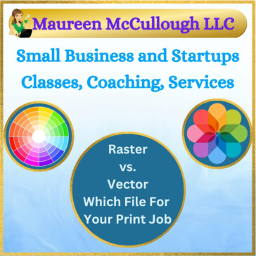
Raster vs. Vector: Choosing the Right File for Your Graphic Design Job

Tired of blurry pixelated logos? Don’t know which type of image to use for which type of graphic design project and end result? Our expert graphic design knowledge ensures your raster or vector images are perfect for print the first … Read More

RGB vs. CMYK vs. Pantone: Which Color System Should You Use?

It’s All About Getting Your Print Job and Your Branding Correct from the Start Designing something for print or digital? Choosing the right color system can make or break the final result. If your logo looks off, your flyer prints … Read More

What Makes Pantone So Precise? A Designer’s Take on PMS

If you’ve ever wondered why your logo looks slightly different on a t-shirt versus a business card, or why your branded packaging doesn’t match your brochure – this article is for you. When color accuracy really matters – like for … Read More

Understanding CMYK – The Gold Standard for Print

You’ve probably seen the letters CMYK on a printer or print shop quote and wondered what they really mean. If you’ve ever printed something that looked darker, duller, or just “off,” as compared to your computer screen, chances are this … Read More

What Is RGB and Why It Doesn’t Work for Printing

If you’ve ever been shocked by how dull your printed design looks compared to what you saw on screen, you’re not alone. The culprit is often RGB. Most people don’t realize there are different color systems for digital vs. print. … Read More