It's All About Getting Your Print Job and Your Branding Correct from the Start
Designing something for print or digital? Choosing the right color system can make or break the final result.
If your logo looks off, your flyer prints too dark, or your packaging doesn’t match your branding - you’re likely dealing with a color mismatch.
Choosing the right color system isn’t just technical, it’s strategic. It affects how your audience perceives your brand, how confident your materials feel, and how consistent your visuals appear across platforms.
Let’s break it down here in easy to understand terms so that your next design and print job look exactly how you intended, for brand consistency.
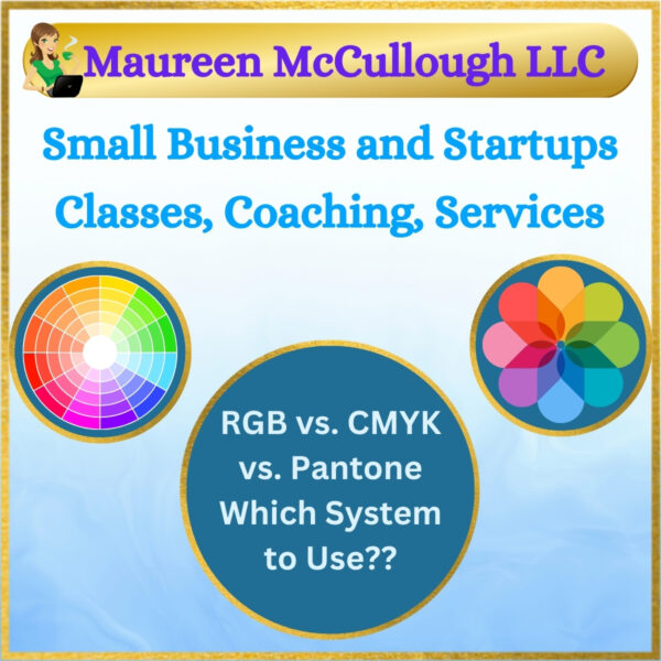
RGB vs. CMYK vs. Pantone - what they are, when to use them, and how to make the right choice.
We help clients across Bergen County and New Jersey navigate color modes, prep files for print, and create custom design work that translates flawlessly from screen to paper.
A Recent 5 Star Client Review on Google -
Maureen created incredible Save the Date cards, Wedding Invites, and RSVP cards for my upcoming wedding.
I wanted custom invites and trying to create them myself was frustrating.
Maureen was easy to work with and very knowledgeable!
All of my wedding stationary came out beautifully with the design she personalized for me.
Heather H.
RGB: Best for Screens
Use RGB for:
- Websites
- Social media graphics
- Digital ads
- Presentations
- Anything staying online or on-screen
RGB (Red, Green, Blue) is the additive color model used for digital displays.
It creates bright, vibrant colors by combining light. But it doesn’t work for printing - those same colors often shift or dull when ink is involved.
CMYK: The Industry Standard for Print
Use CMYK for:
- Brochures
- Business cards
- Flyers
- Menus
- General printing
CMYK (Cyan, Magenta, Yellow, Black) is the subtractive color model used by printers. It uses ink layered on paper, and it is the standard for most print projects.
However, it has a more limited color range than RGB - so colors may look slightly less vibrant.
Pantone (PMS): For Precise Brand Colors
Use Pantone for:
- Logos
- Packaging
- Brand identity
- Specialty projects
- High-volume or high-precision printing
Pantone colors are pre-mixed spot colors - each with a unique formula. If you need exact color consistency across print jobs, locations, or materials, Pantone is the most reliable system.
It is also used for specialty inks like metallics or fluorescents.
Not Sure Which One to Use?
Our quick comparison chart below is a great resource!
| Use Case | RGB (Digital) | CMYK (Print) | Pantone (Exact) |
|---|---|---|---|
| Website / Social Media | ✅ Yes | ❌ No | ❌ No |
| Business Cards / Brochures | ❌ No | ✅ Yes | ✅ Best for Branding |
| Product Packaging | ❌ No | ✅ Yes | ✅ For Consistency |
| Logos / Brand Colors | ❌ Not Ideal | ✅ Acceptable | ✅ Best Option |
| High-End Specialty Printing | ❌ Not Used | ✅ Often Used | ✅ Premium Choice |
Understanding RGB, CMYK, and Pantone for Printing and Design
Not all colors are the same or one-size-fits-all. Color systems aren’t just technical - they affect how your brand is seen in print and online.
When the correct color system is used from the start there are no unpleasant surprises later.
Learn more about RGB, CMYK, and PMS / Pantone
Let’s make sure your next design looks as good on paper as it does on screen.
Questions? Need design - color - print production help? Contact us!
Our Branding Packages............
Full Professional Logo & Branding Package – $1700